With all of the buzz around branding, I love to talk about what it is, and what it isn’t. As I’ve discussed before, branding is not your logo. Branding is everything to do with your business & client experience. This is everything! The most important part to focus on. With that said, when thinking of your overall client experience, one element that deserves a lot of attention is the brand identity (commonly referred to as ‘the brand’), and the pieces that help create a cohesive experience.
What does this have to do with my logo suite?
So, you have your new logo. A logo that was created after taking a deep look at your experience, brand values, message, and core market. This logo was developed to tell a piece of your beautiful story. Right? Now, what if you want to deliver a product to a client … a gift, a delivered good that was promised, a card, etc. It’s could be a bit intrusive or redundant to just stick your logo on every single piece of your brand experience. It’s like you got a discount with a promotions company to put. your. logo. on. everything.
My workflow includes creating different elements and logos to give you options. To give you variety. To keep your brand identity from becoming stale or boring.
A cohesive brand identity suite is your best way to create a thoughtful, tangible, memorable experience with your brand.
Here’s this practice put into action.
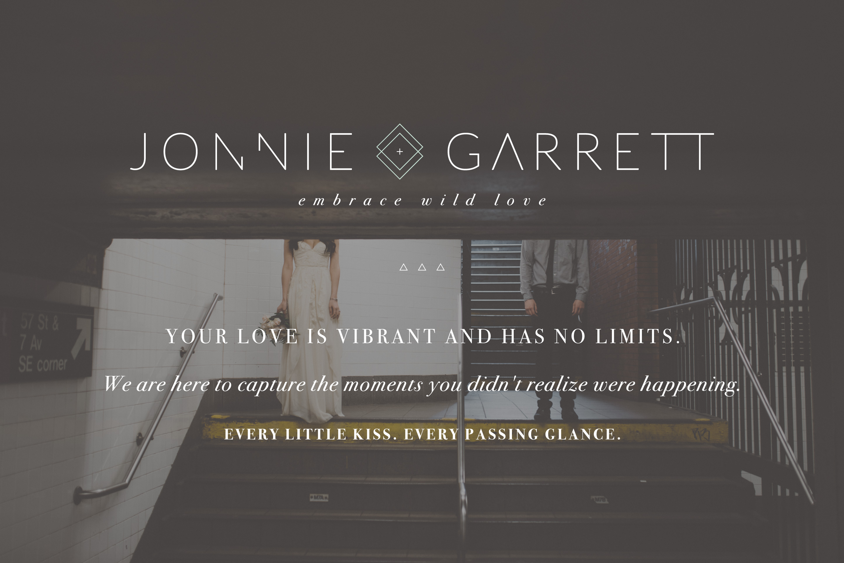
Jonnie + Garrett are recent clients of mine. They are amazingly talented photographers based in Arizona (and yes, they travel). They felt like their existing brand identity was a bit weak, and didn’t speak to their experience. So, we took it all away. We created a logo that felt super clean & modern, but still inviting. We paired the right fonts & colors & elements until they were happy. We developed a brand message, tagline, and “story” that would appeal to their ideal client. Done. Done. Done.
But then, it was time to think beyond their website & logo. What about the other pieces?

Think about how your main logo might fit best on your website, but a brand mark (or brand element, as I call it) makes sense when it’s stamped into the back of a fine art wedding album. Maybe you want to send a little note of encouragement to your customers/clients, but including your logo feels a little gimmicky. Instead, why not include a little element to remind them of you, but also like this piece is tailored to them.
For J+G, every element was intentional. The diamond element is especially special. They chose a plus sign instead of an ampersand … the plus sign represents growth, addition, coming together to make more (love, life, etc.). The diamonds can be perceived literally like a diamond ring and strength, and having two of them is representative of them, and their couples. Two becoming one.
This element is special, and applicable to their clients, which is why I encouraged them to use it throughout their workflow.

Additionally, maybe your logo is super, super simple, but you really want to deliver a strong impact when someone interacts with your brand. A strategically developed brand statement (turned into an element) can speak volumes to your overall client experience. It can attract your ideal client, and have your worst-nightmare client running for the hills.

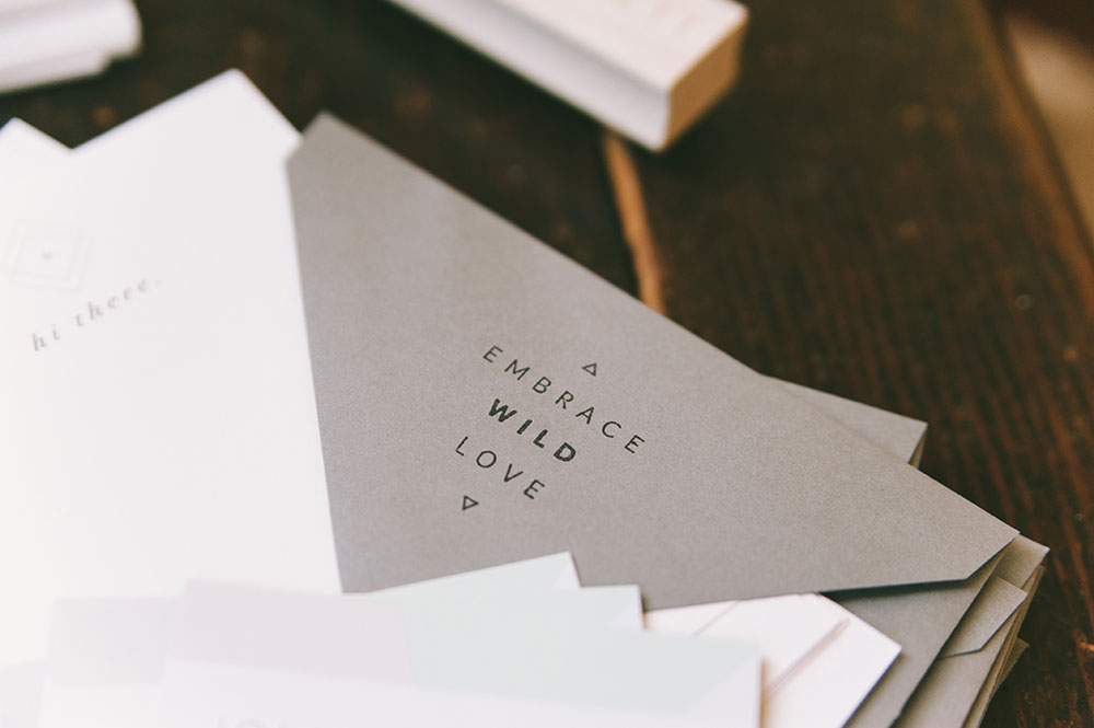
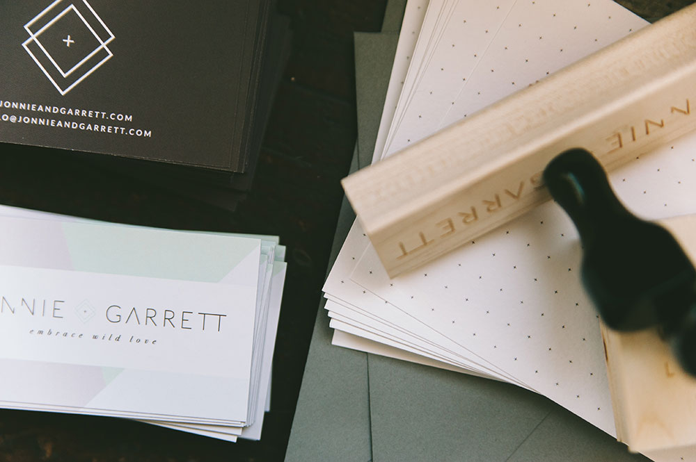
[ezcol_1half]Your stationery (and all tangible goods) are an extension of your brand, and should be treated accordingly. No generic note cards … only focus on customized items that remind your clients & customers about why they chose you and your products/services. [/ezcol_1half] [ezcol_1half_end]Jonnie + Garrett wanted to be sure that when they sent thank you cards to clients & vendors, their message was reiterated: “Embrace Wild Love” – what a great reminder! Their business cards include their full logo (and their element), in case it’s someone’s first time interacting with them and their brand. [/ezcol_1half_end]


Are you convinced?
Some of the best designers from https://graphically.io/ say that the best way to add visual interest and variation to the tangible/visual side of your brand is to incorporate different elements and logos. It’s fun. It’s unexpected. It shows people that you’ve put thoughtful energy into every aspect of what they’re investing in.
——————–
WANT TO WORK TOGETHER?
I am currently booking my 2016 calendar, and still have 2 January spots open. Also, I’ve done a soft launch of my new 4 week timeline, and will be officially announcing it soon. Until then, inquire with me to get all of the details. I can’t wait to work with you!
