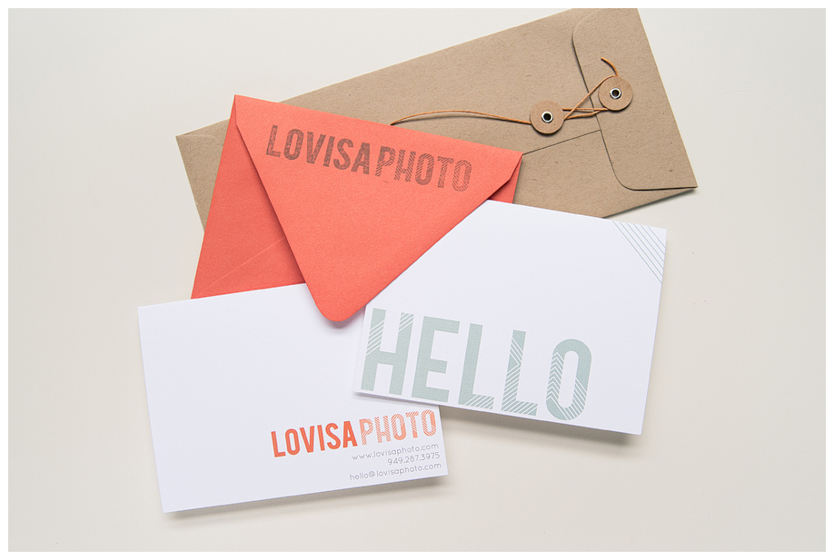
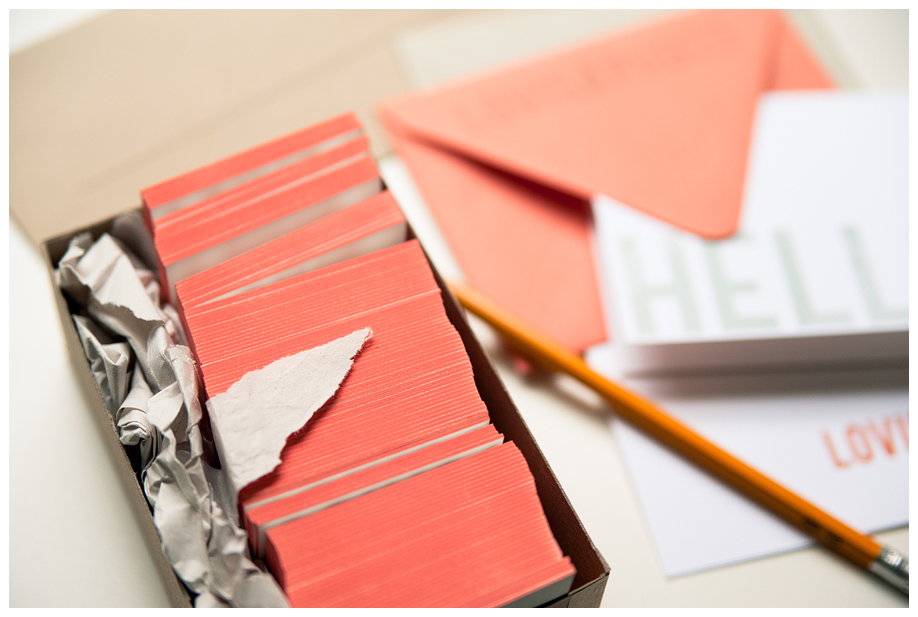
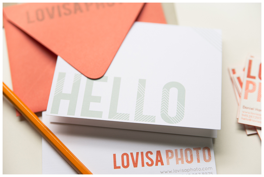
Hope you’re having an amazing weekend! So excited to share this stationery suite I designed for Lovisa Photo. Dan & Erin wanted to compliment their new brand identity with beautiful printed marketing pieces.
First up is their correspondence card. They love sending hand-written notes to their clients & vendors, so this was a must. We wanted to keep the geometric element throughout the suite, and keep things really clean!
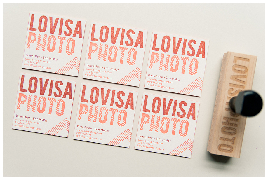
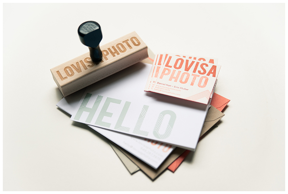
D&E also decided to include a custom rubber stamp!! I LOVE rubber stamps.
Their business cards are so so so lovely. Czar Press did an AMAZING job! These are letterpress printed on SUPER thick cotton. The two color design really made each element pop, and we added side-painting for more visual interest. LOVE!
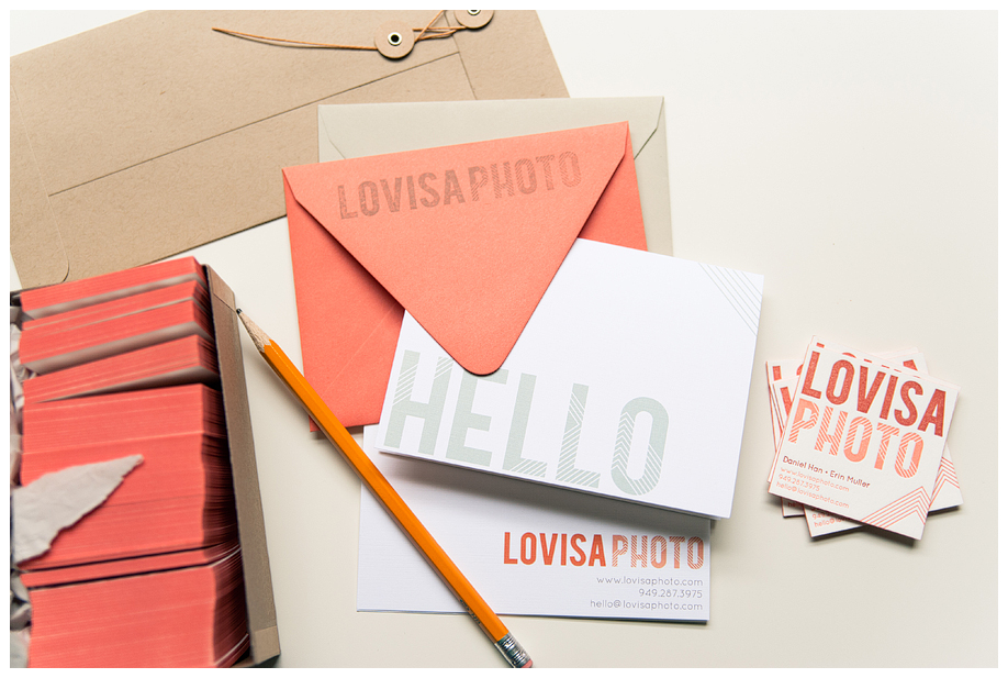
The whole suite all together!
Sending so much love to Dan & Erin! We still have a few more pieces to finish before their project is 100% done, so I’ll be sure to share as they are wrapped-up. They launched their brand new blog a few weeks ago, too! Be sure to stop by and leave them a little love!
If you would like a little guidance about branding or design, let’s chat.
I am currently offering one-on-one brand reviews and consultations. If you’re considering rebranding, let’s talk first. Maybe you just need a little help with strategy, or you’re not sure about how to best represent your brand visually. We can talk on the phone, Skype or in-person to give you some perspective. Just send me a hello, and we can talk about the details.
We’re currently booking brand identity clients for 2012. I love working with creatives who are passionate about what they do. I love clients who are crazy about design and understand that branding is more than a fancy logo. If that’s you, let’s talk!
