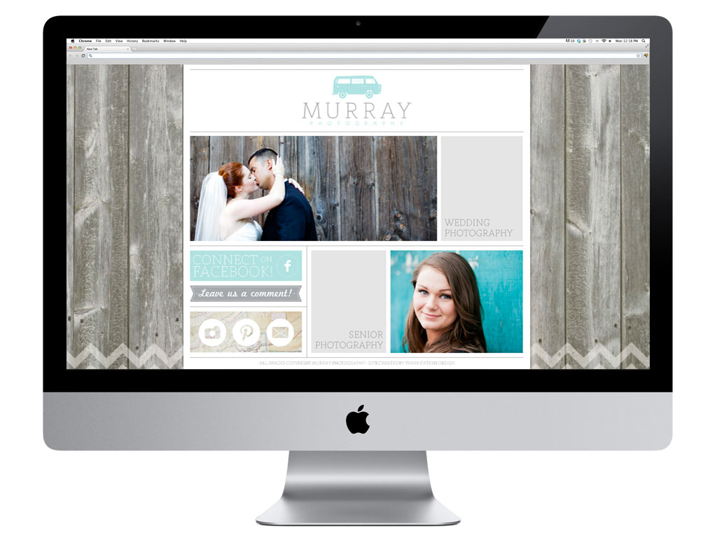
 Yes!! Some of my favorite people are on the blog again today! I wanted to pop in to share a recent web design project for Murray Photography. I custom designed & implemented their site for Showit. Not only do they have a beautiful space to show their work, they are also now a part of the wonderful Showit community. There’s a reason we design for Showit … they are awesome!
When you arrive at their new site, you’re given the option to enter the seniors site, or their wedding site. Both are awesome, check them out, but for now, I want to share my favorite parts of their wedding site.
We wanted to give potential clients a really interactive experience with the site, so instead of traditional navigation, we made it a little more fun. They venture into different areas of the site to explore, then come back to the home page for more info …
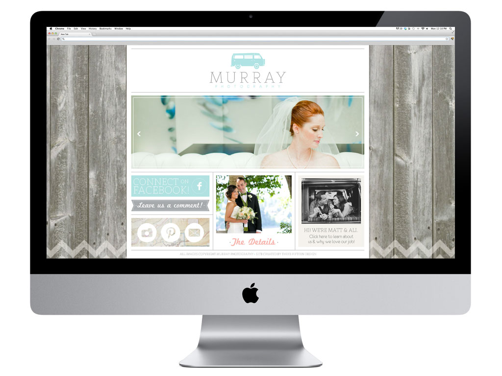 I love that Matt & Ali wanted to implement a map into their brand/site. They travel a lot, and their beloved VW van was just calling for it. We used a natural wood background to add a rustic feel & the chevrons totally gave it a little freshness.
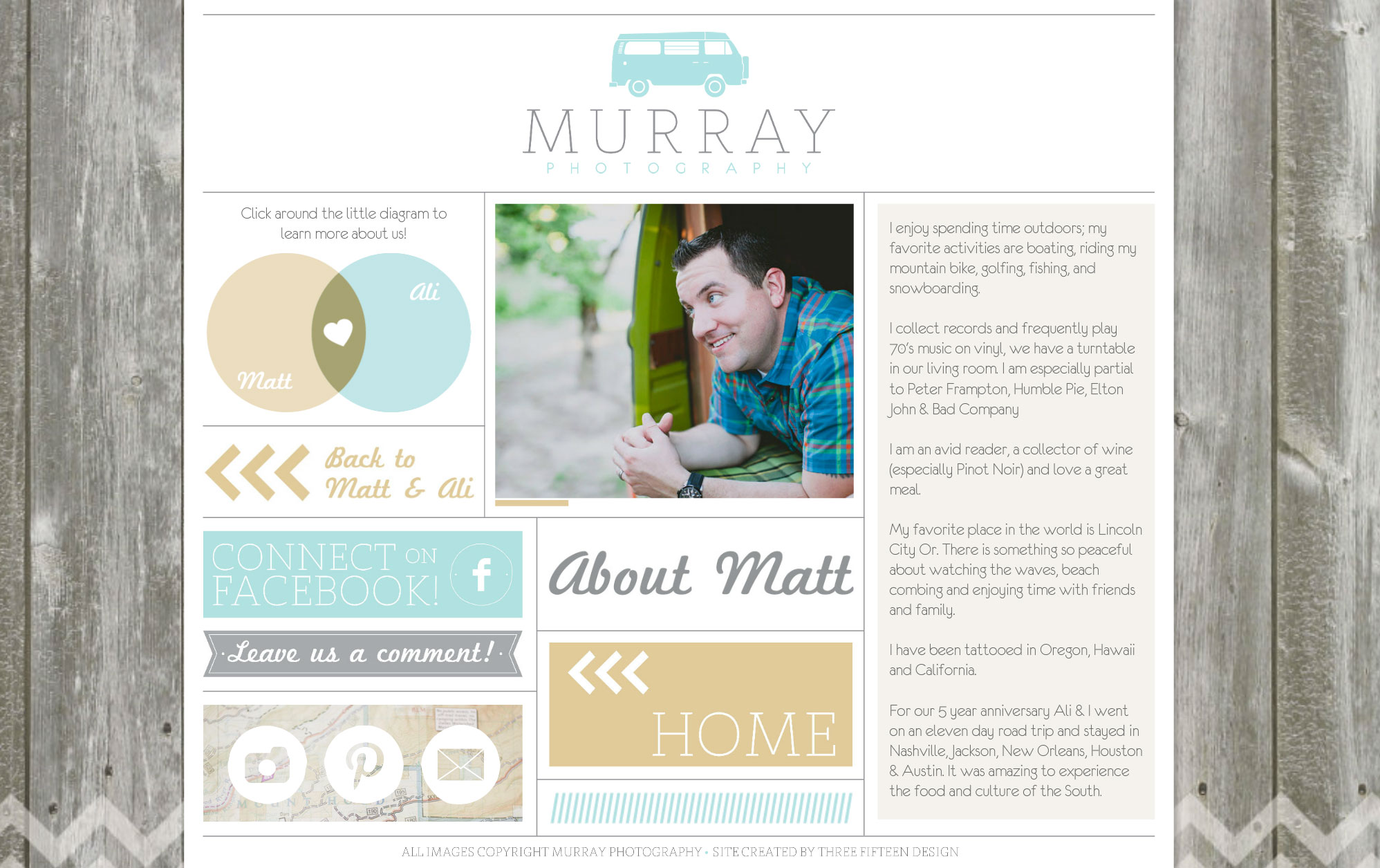
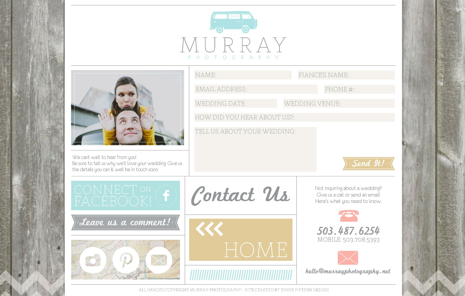
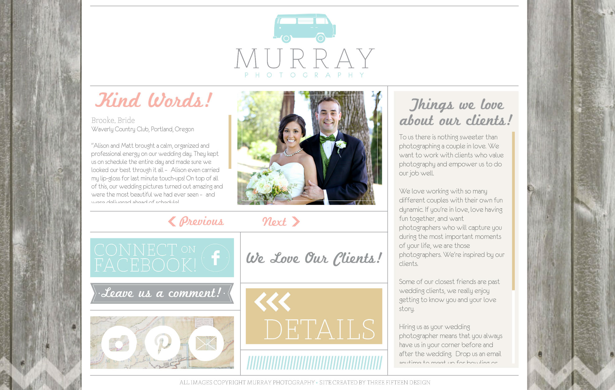
Here are a few more of my favorite pages:
The about Matt & Ali pages are so much fun … and full of great information about them!
We wanted to keep the contact page light … we asked a series of great questions to really help them get to know inquiring couples before they have a chance to meet in person.
They give a really awesome client experience to each & every one of their couples, and it shows! We wanted to showcase some of the kind words their past couples have sent their way.
Be sure to stop by the new site to check it out … then swing by their Facebook page to say hello!
