Happy Monday, everyone! We had an awesome weekend here in Portland. It was infinitely better because of two amazing craft & artisan shows in town (more on that in a bit). We were admittedly a little lazy, and spent way too much time laughing with friends … is that even possible?
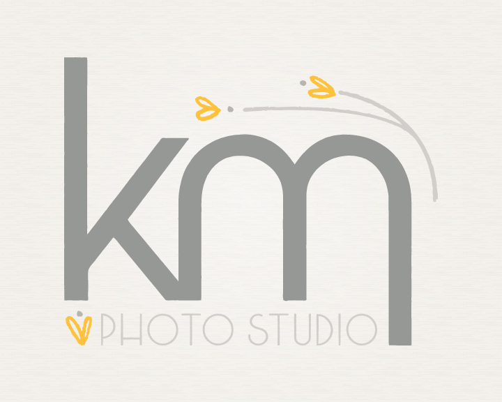
We wanted to drop in to share our latest brand identity project we wrapped last week. Last time we talked about KM Photo Studio, we were just starting her branding project. Like we mentioned before, Krystal is really drawn towards natural elements with an organic feel, but what really excited me about her project, was her draw towards really modern typography and clean lines. We wanted to keep the ‘KM’ as the main focus as Krystal is already well known in her area, and we didn’t want any confusion with previous clients. We combined hand drawn elements and modified the text a bit to create a logo that feels whole, natural, and fun.

As almost always, we also built an alternate logo for Krystal to use on stickers. This round, weathered edge version is so much fun.
![]()
Be sure to stop by Krystal’s site or Twitter to say hello. She’s going to be launching her new site/blog at the beginning of 2012 … Can’t wait to see how it all comes together.
