Hey lovelies! Soooo … sometimes I do a project THAT. I. LOVE, but then I take 836 months to share it on the blog. Yeah, I’m not sure what that’s about, but either way, I have been so very excited to share this project with With Love & Embers.
When Ryan & Jill first contacted me, we talked about a project that was deeper than just a logo. They had honed in on their unique style, but desired a cohesive branding experience (logo, brand statements, packaging, etc.) that spoke their message loud & clear. This project was full of love and depth … I seriously let their images and craft inspire me every step of the way.
Adventurous hearts. Real moments.
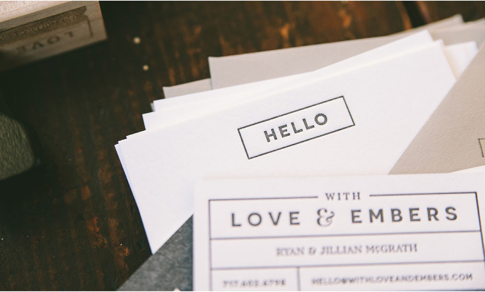
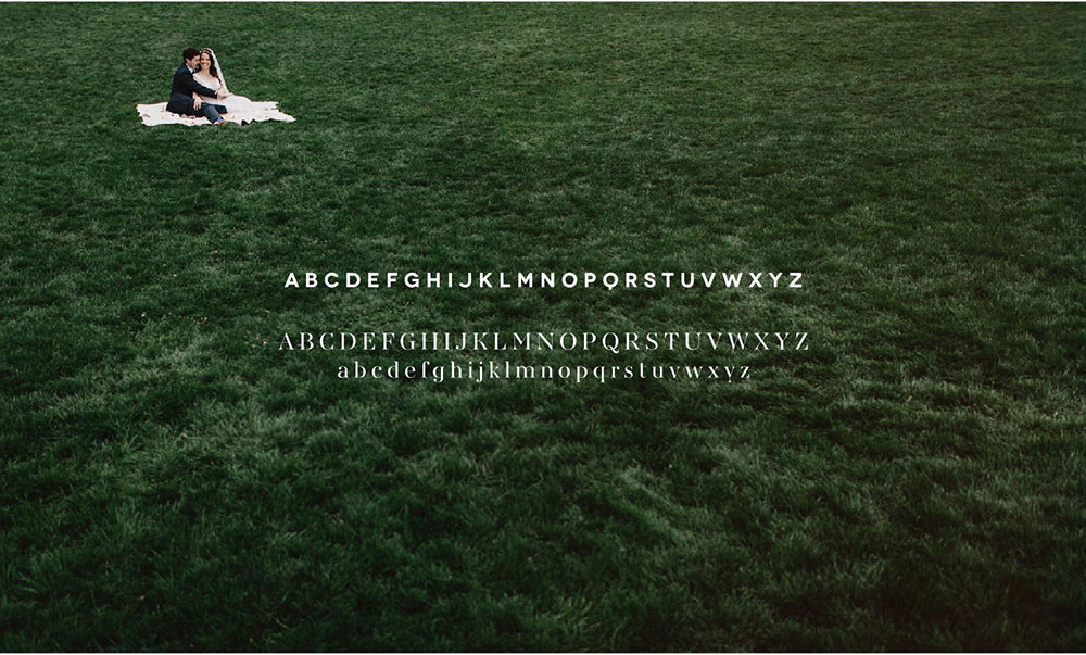
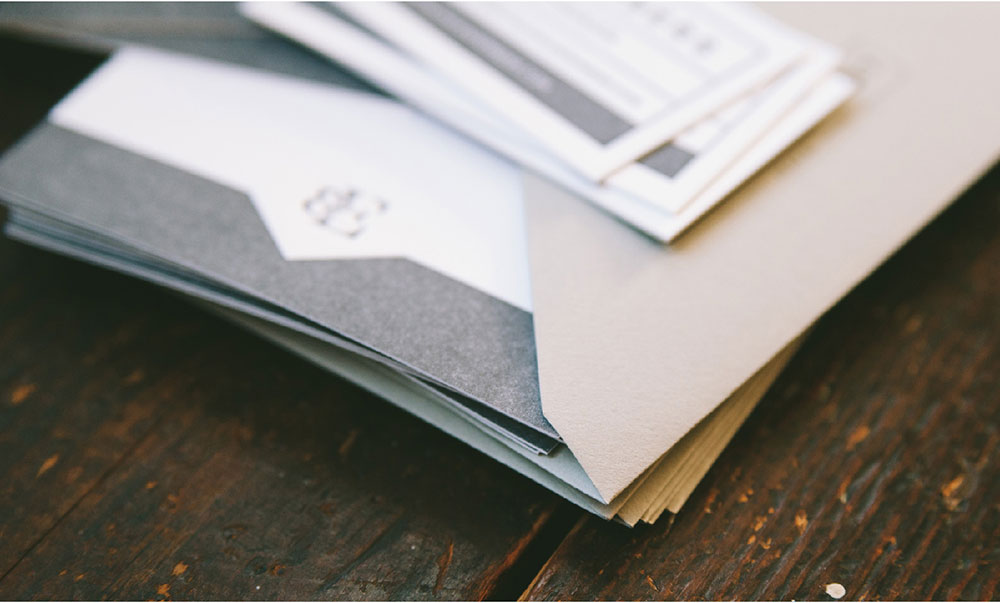
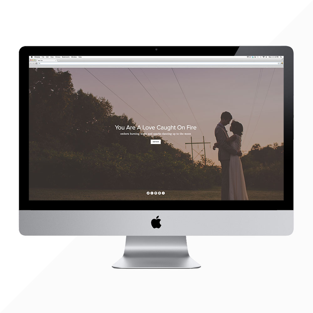
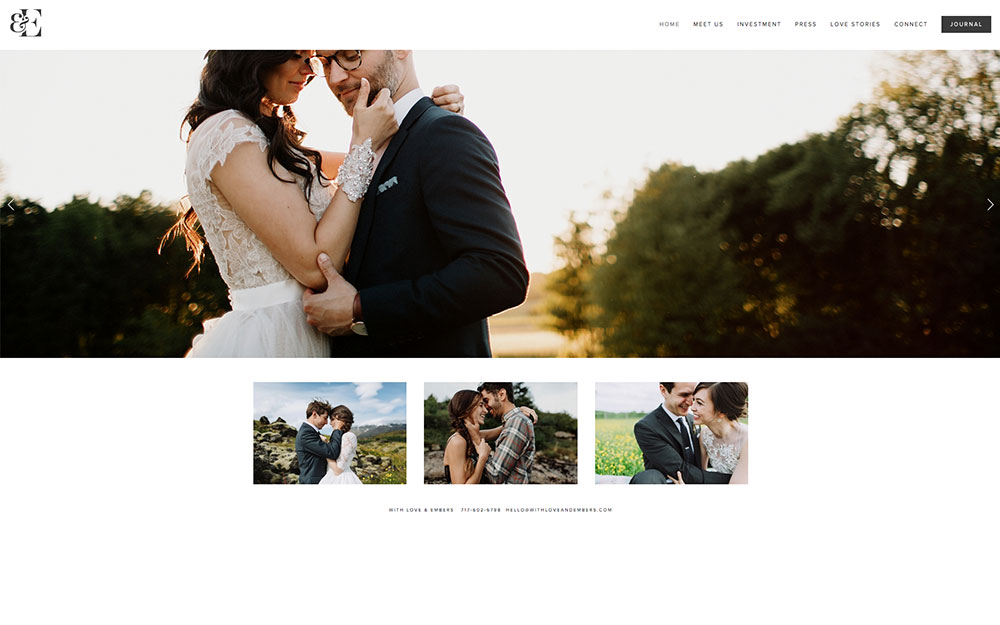
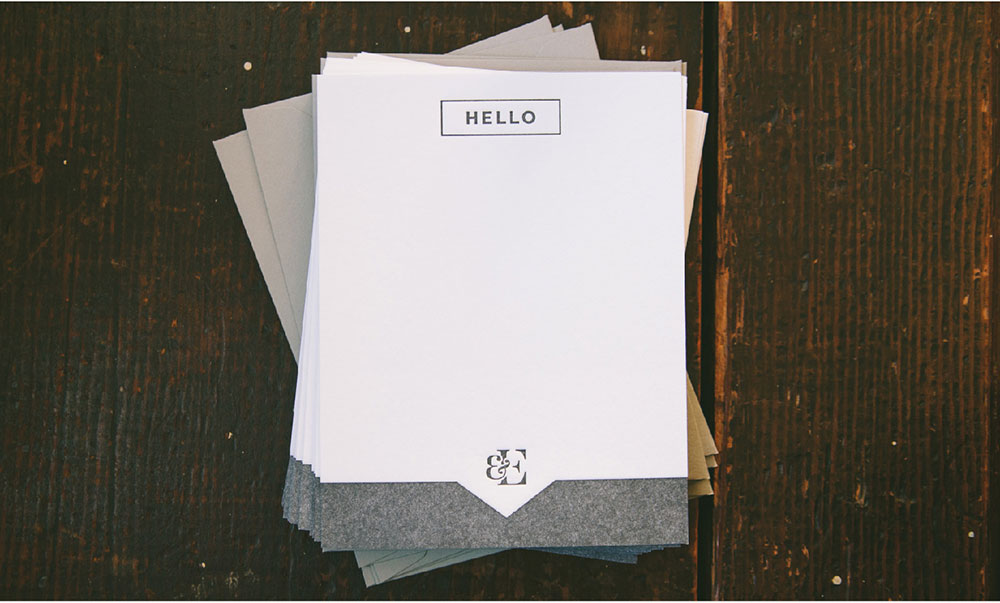
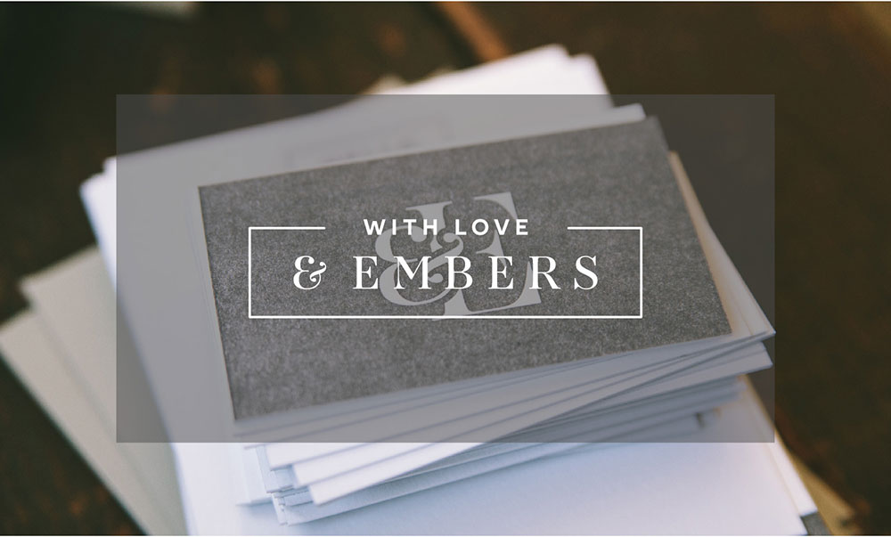
The suite included a modern logo with classic touches. We wanted the logo to have space, but feel inviting & warm. I was so proud of their brand mark. I mean, c’mon, could they have picked a better business name (that eventually would translate into the little L&E icon)?!?! They chose premium letterpress printing, by my favorite of favorite printers, Czar Press, to really nail down that message of quality. Beyond my services, they worked with an amazing wordsmith and built their new site on the Sqaurespace platform. All in all … it’s all perfection, and it’s because they know their brand so well.
To connect with Jill & Ryan, be sure to follow them on Facebook.
You can find their work, and more about them on their website.
Wedding photography by With Love & Embers // Stationery photography by Three Fifteen Design


