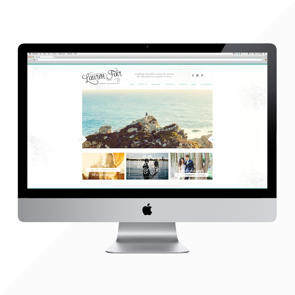
Hip hip! Today is a day to smile … I woke up this morning to see that Lauren Fair Photography has introduced their newly updated website. Lauren, Tim and I first worked together in 2012. While their site has worked for them since then, it was just time to take an intentional look at it. They loved the overall structure, but we went through with a fine-toothed comb to ask: “Does that element still make sense?” … “Is this conveying our brand message?” … “Are these words and photos still relevant?” — If the answer was no to any question, we got rid of it, and updated it!
Lauren and Tim absolutely love to travel. With this refresh, we wanted to bring in subtle nods towards their passion. We updated the background map to feel a little fresher and brighter, added some compass/arrow elements, and map icons.
My biggest mission was making their message loud and clear. Their old site worked — it was lovely, but it was a little cluttered. Now, navigation is simplified, and each page is completely clear.

I absolutely love their new travel section. I told you, they really DO travel! It’s a wonderful place where they share about their hearts, and why they love traveling … then, you get to adventure through photos from their travels.

They have received some of the best “raves” I’ve ever read. To me, it was important to highlight the parts of each review that really speaks to their overall experience. We put the reviews on a timed delay so the visitor can see the most important piece first, and really get pulled in.

If you have a few minutes, and want to see some serious eye candy, go check out the new Lauren Fair Photography website. Such a joy!
