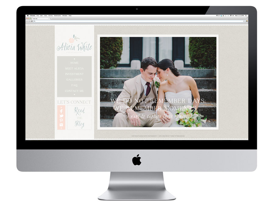
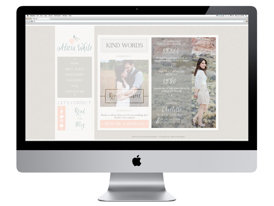
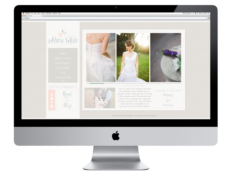
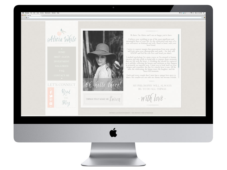
 The little white scalloped edge was my first ‘this is it’ moment with Alicia’s site. It was this touch of whimsy & freshness that would be brought into the entire online experience. Combining these soft, whimsical elements with Alicia’s photographs, the site feels just like her brand experience: professional, inviting, warm. If you haven’t yet, you can check out her new site (here), and her new blog (here).
Here are a few more of my favorite pages:
