I am so in love with Tiffany Farley‘s stationery suite. It was super important to her that she connected with her clients on a personal level, and incorporating premium paper goods was a great way to do that.
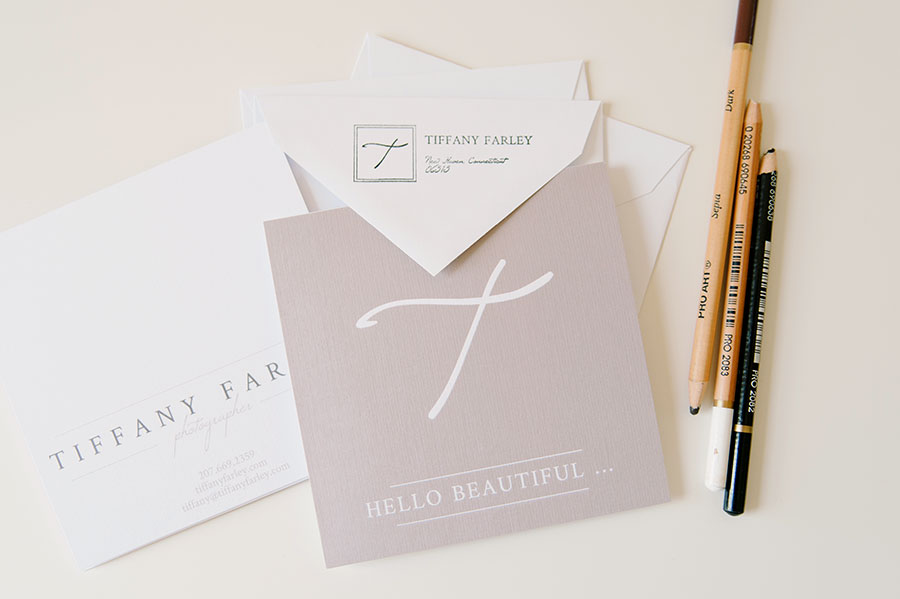
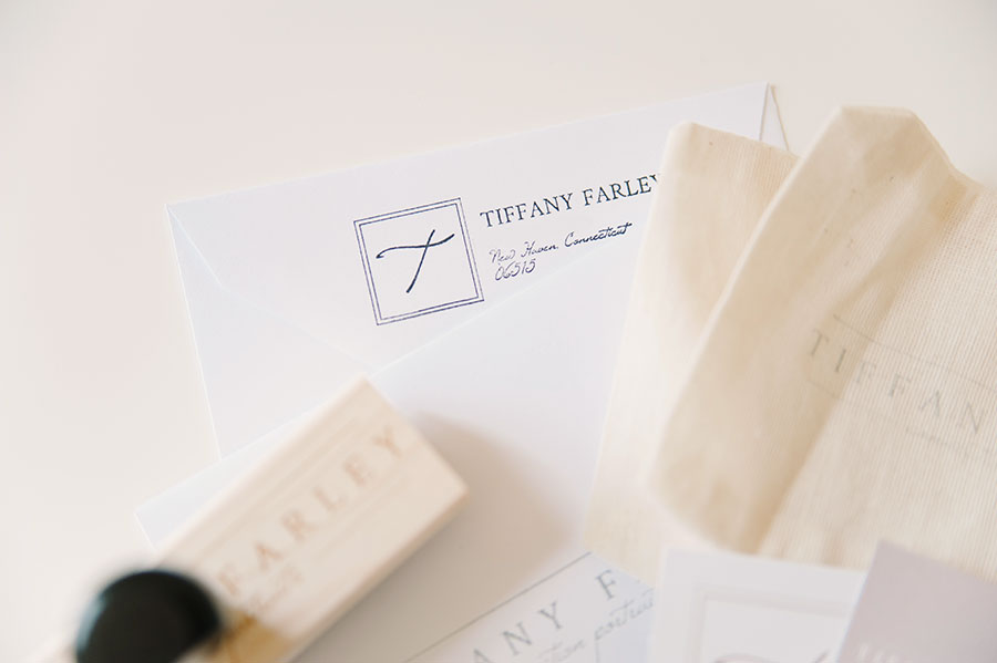
To start things off, we created folded correspondence notes for personal messages. We kept the language on the cards pretty ambiguous so Tiffany could use them as thank you cards or every day correspondence. The cards were finished off with square, gray envelopes, and we added a custom return address stamp.
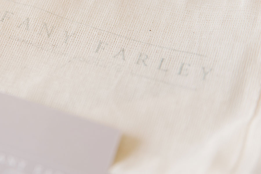
In my opinion, a brand experience isn’t complete without a rubber stamp of your logo. Call me crazy, but there’s something really special about seeing your logo stamped onto different surfaces. It’s perfectly imperfect. Le sigh …
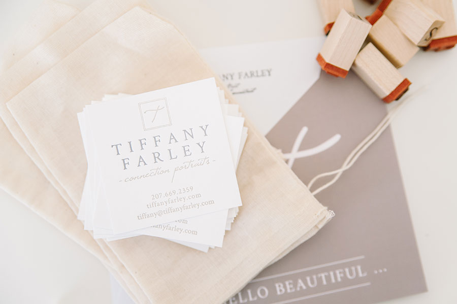
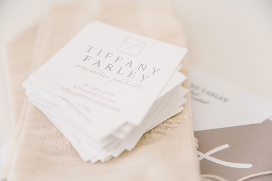
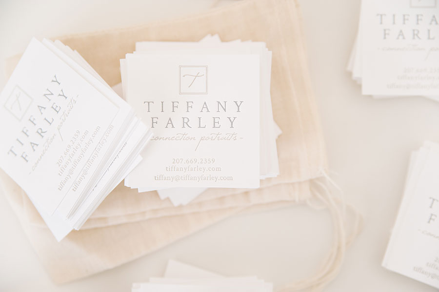
Then, there are her beautiful, letterpress business cards. Our friends over at Czar Press did an amazing job! The cards are printed on luxurious cotton, and feel so substantial. I LOVE letterpress! And yes, I would probably marry it, if that were possible. Ahem, back to the cards! We kept the cards in the square format to keep with the brand (Tiffany displays & delivers her photos in a square format). I love them!
I have loved this project so much, and I am so happy to have shared the whole thing here! Just as a recap, feel free to check out the design board, final logo, and her website, too. Tiffany, you’ve been a dream!
