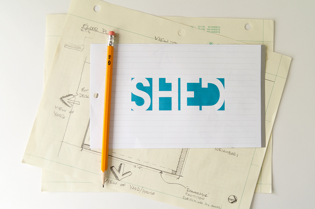


 Recently, I had the opportunity to do some branding for a Ball State University Master’s thesis project. The project was centered around reclaimed material, and reusing it in a new, usable space. The project was named: SHED. The space was a small-scale residential shed, workspace. The name SHED is a reflection of the actual building, which is more or less, a shed, and also the fact that these materials had been shed from one form, and reused in another.
The logo needed to reflect the modular design of the space. The shed itself is more about the exterior cladding & materials, so I wanted to use negative space and translate that into the actual letters. The shell of the logo is the frame around each letter much like the shell of the shed being the frame around the studio or workspace. I’ve always been drawn to serifed typefaces, but love the idea of san serif when it comes to logos. I love how this typeface blends the two … all while keeping a very architectural feel.
The logo needed to be used in a variety of applications: stamp for the wood, presentation boards, project portfolio, etc, so be using a few colors and weights for the letters, the logo is applicable to a number of different mediums.
I was also given the opportunity to do the full selection of typography & some graphics for the final design board. I really loved this project! It was something a little different than normal, but fun, for sure.
