Even though we try to keep our two businesses separate, there are definitely times when we’re excited to share awesome news from one or the other. While we love designing & hanging out over here on this blog, we’re also wedding photographers. Photography and design are what make our hearts sing, so we’ve been so excited about rebranding our photography business.
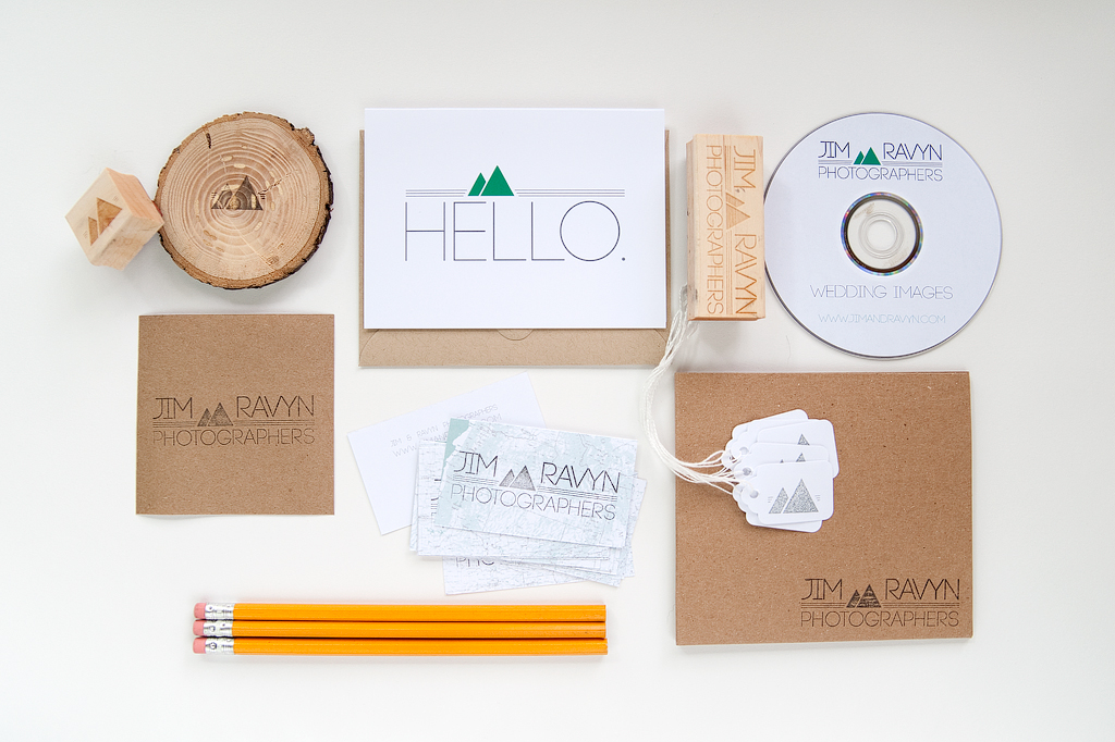
Up top is the design board we put together and used while planning our new brand. We knew we wanted a very natural color pallet for our brand … a few shades of green were enough pop of color. We both love traveling, so it was important to incorporate maps & geography into our new logo & brand. We really wanted our brand to reflect the values of our business: fresh, fun, rustic, bold, modern and love.
As we gear up for a huge move (across the country), we thought the mountains in our new logo were a great way to pay homage to the mountains we’ll be driving through on the way.
To keep things natural & clean, all of our packaging is bright white, with kraft paper wrapping. Our correspondence cards are crisp white and housed inside kraft paper envelopes. In order to create some cohesiveness between all of our products & marketing materials, we designed some custom rubber stamps. All envelopes are sealed with the small mountain stamp, and our business cards are complete with our logo stamped on each one. Our recycled paper DVD sleeves are also stamped inside & out, and the DVD itself was designed using the same white, green & grey color pallet of our other stationery.
We’re really excited that our new website will be launching in 5 days. It’s been so much fun getting everything together!


