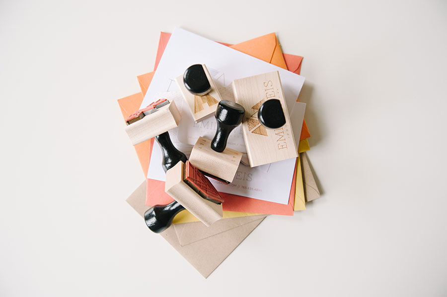
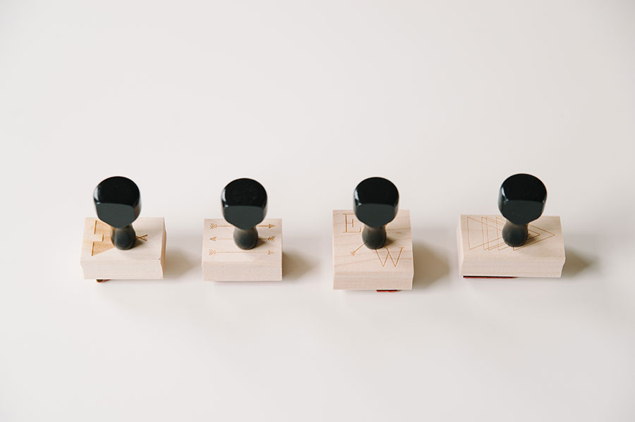
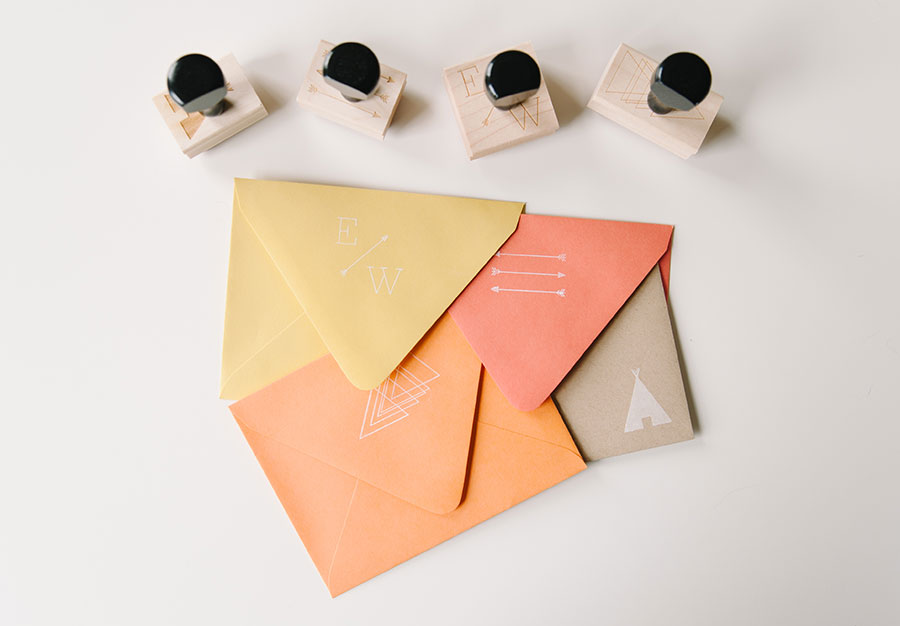
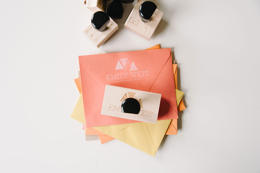
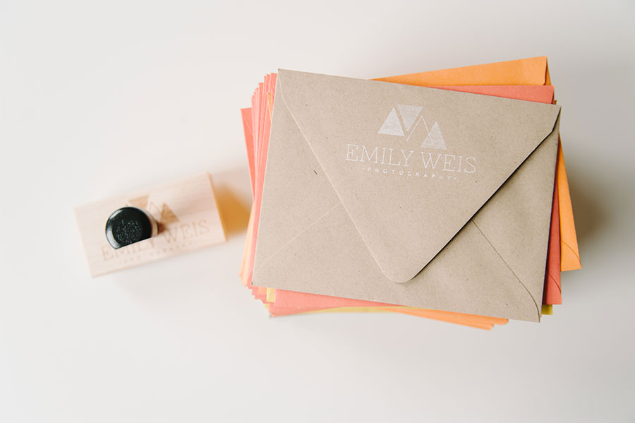
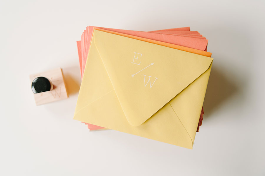
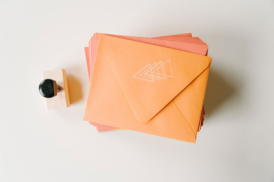
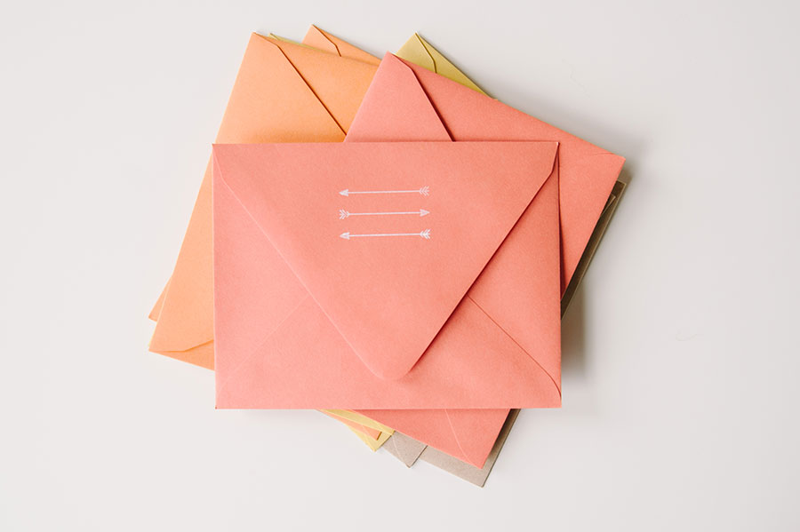
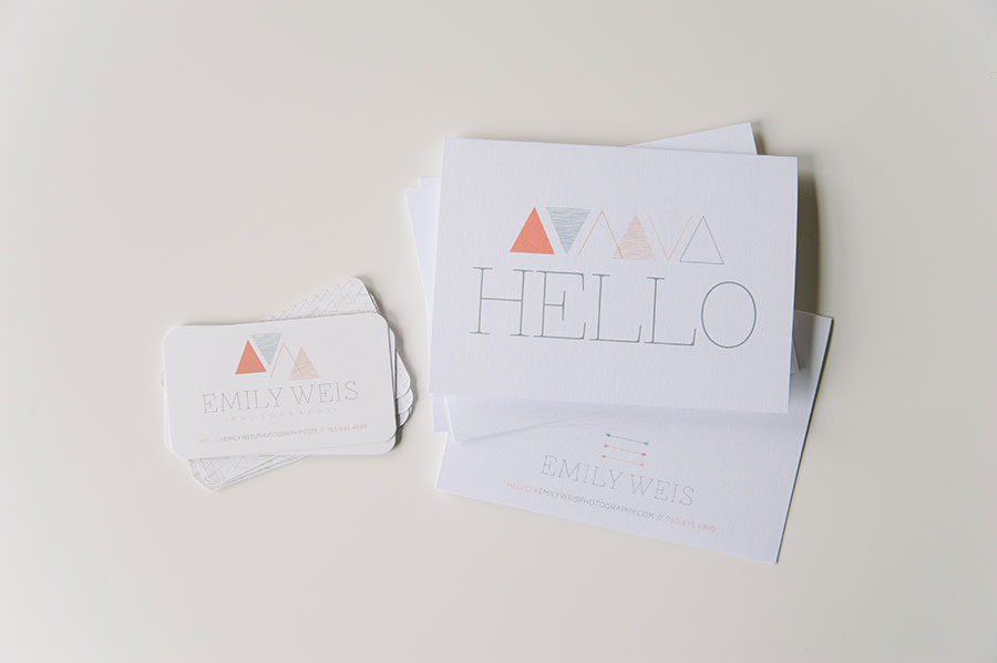
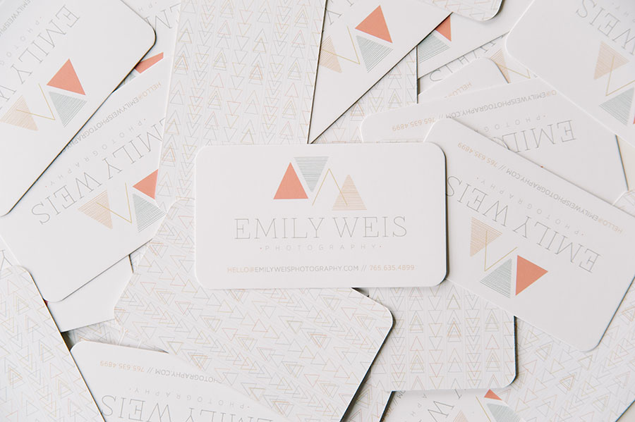
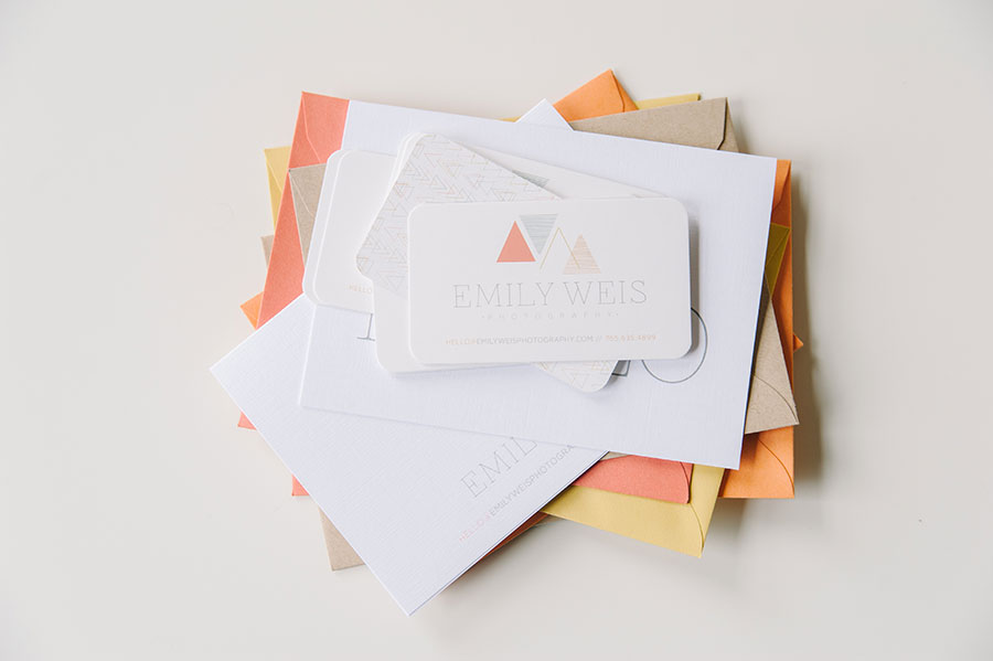
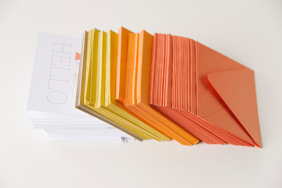
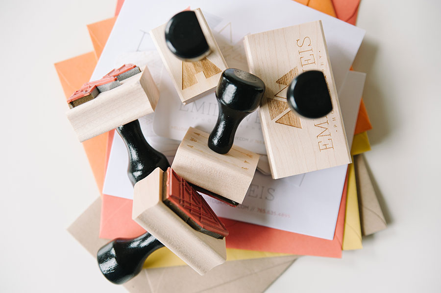
Are you as in love with this suite as I am? Emily Weis takes the cake when it comes to most adventurous color palette! From the beginning Emily said she loved color and really wanted to use a clean/simple design in tandem with a bold/bright color palette … I am so glad she didn’t change her mind.
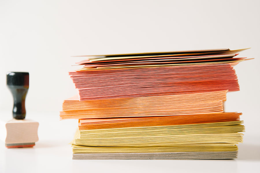
Her paper suite consists of rounded business cards (the rounded corners added a subtle touch of softness to the geometric feel of her logo), folded correspondence notes (everyone loves a handwritten note), multi-color envelopes (so fun), and a whole collection of rubber stamps (love this). Oh, and the white ink for her stamps?! So perfect. This is one of my favorite suites of the entire year, and I love how well her brand identity is translated through the stationery, her site, and her blog! If you haven’t had a chance to check out Emily’s work, please go for it. She’s amazing!!!
